

Opened 14 years ago
Last modified 5 years ago
#7571 new enhancement
Replace the old dark blue with the lighter variant
| Reported by: | polari | Owned by: | stippi |
|---|---|---|---|
| Priority: | normal | Milestone: | R1.1 |
| Component: | User Interface | Version: | R1/Development |
| Keywords: | Cc: | ||
| Blocked By: | Blocking: | ||
| Platform: | All |
Description
There are several clashing shades of blue used across the UI. The one that's probably most appropriate is 102, 152, 203. Off the top of my head places where this should be set to default are the Navigation base, the loading widget in Tracker and where it is used to indicate that a setting has changed in the Tracker preferences (although eventually the Tracker preferences should probably be changed to a tab view to be consistent with the rest of the system).
Attachments (4)
Change History (11)
by , 14 years ago
| Attachment: | webpositive-blue.png added |
|---|
by , 14 years ago
| Attachment: | webpositive-light-blue.png added |
|---|
comment:1 by , 14 years ago
by , 14 years ago
| Attachment: | webpositive-orange.png added |
|---|
follow-up: 3 comment:2 by , 14 years ago
I am also for unifying the shades of blue. There is also one which is not visible here, used for check boxen and radio buttons. I would try that one for the navigation color, since it should be a similar hue of blue. The shade does not necessarily have to be the same one, IMHO, just the hue. While the second suggestion is almost OK, I find it too light. The orange is definitely too light and i find it ugly.
comment:3 by , 14 years ago
Replying to stippi:
The orange is definitely too light and i find it ugly.
Don't bother to much about the shade, that can be adjusted. What's important is what the colors are used for. Orange = Active element (such as Window, Button). Blue can be used for things that should not attract the eyes attentions, such as the progress bar in the screenshots above. Shading and/or rounded corners would be a good thing to look at implementing.
by , 14 years ago
| Attachment: | Screenshot-2.png added |
|---|
comment:4 by , 14 years ago
I agree that a similar hue is fine, it's only really the dark blue that clashes.
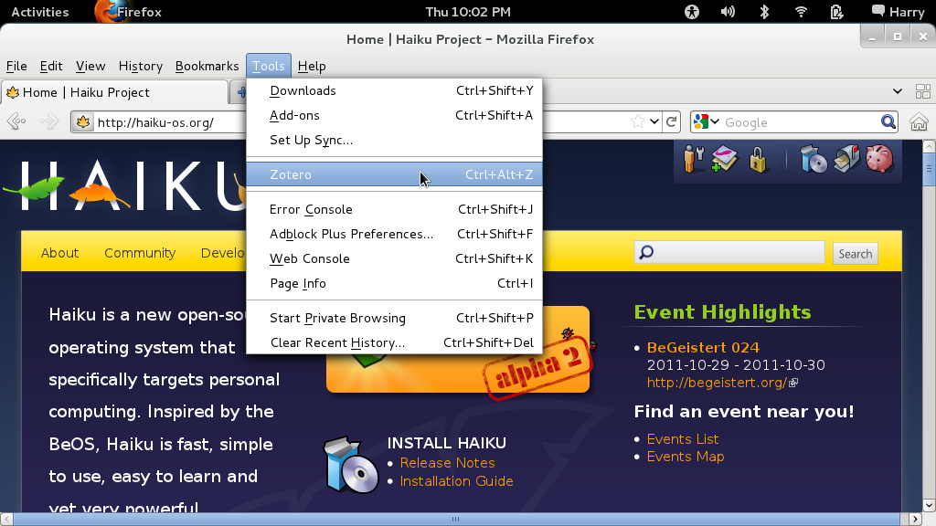
While we're on the topic, I'd be curious to see how a blue (with white text) looks for highlighting menu entries, but that part of the Appearance pref is broken. My concern is that the current black text on a grey highlight on a grey menu might make it difficult for users who have visual impairments. I've attached a screenshot of how Fedora does it as an example.
comment:5 by , 14 years ago
orange isn't very attention grabbing, I think a washed out red might be better
comment:6 by , 14 years ago
| Version: | R1/alpha3 → R1/Development |
|---|
R1 Alpha 3 has not yet been released. This was with an R1 Alpha 3 Release Candidate image.
comment:7 by , 5 years ago
| Milestone: | R1 → R1.1 |
|---|
I'm also not a fan of the ugly dark blue color. The light blue that you suggest is a lot better. I have a third suggestion, and that is to use the same orange as in the Window tab.
The colors function is to attract the eyes to the active element in the user interface. Since the tabs use an orange color, It would be natural for the brain to look for the same color. That's why I suggest (and already use) the orange color.
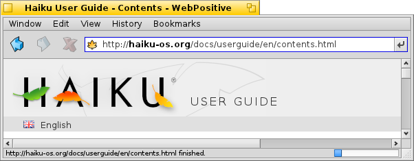
This is the dark blue that is standard in Haiku
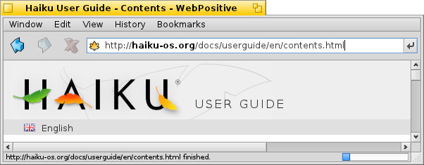
This is the light blue suggested by polari
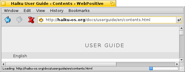
This is the orange used in the Window tabs