

#8505 closed bug (fixed)
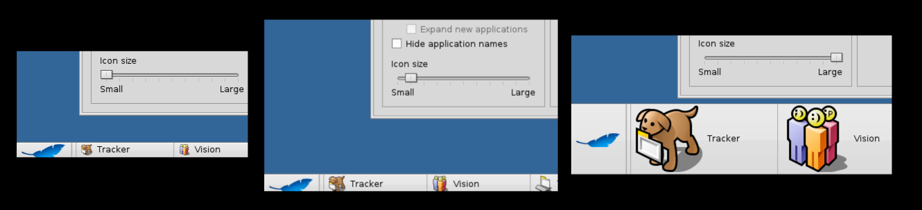
increasing icon size + horizontal position leads to bad graphic display of blue leaf.
| Reported by: | mmadia | Owned by: | jscipione |
|---|---|---|---|
| Priority: | normal | Milestone: | R1/beta2 |
| Component: | Applications/Deskbar | Version: | R1/Development |
| Keywords: | Cc: | ||
| Blocked By: | Blocking: | ||
| Platform: | All |
Description
When a larger icon size is used and Deskbar is orientated in a horizontal position, the blue leaf graphic will show clipping on the bottom.
Attachments (5)
Change History (24)
by , 13 years ago
| Attachment: | clipping.png added |
|---|
comment:1 by , 13 years ago
| Resolution: | → fixed |
|---|---|
| Status: | new → closed |
follow-up: 3 comment:2 by , 13 years ago
Argh! I would have preferred if Deskbar used a vector shape for the leaf, or at least a larger, usually scaled down bitmap, and then enlarges the graphic along with the icons. First of all, it was my aesthetic intention that the leaf is cut-off. Second, if the user enlarges the icons so much, it is probably because the click targets shall be bigger. For example because he has a high-res screen, or hooked up Haiku to his TV set. Why would the logo stay small while the icons are so much bigger?
follow-up: 4 comment:3 by , 13 years ago
Replying to stippi:
Argh! I would have preferred if Deskbar used a vector shape for the leaf, or at least a larger, usually scaled down bitmap, and then enlarges the graphic along with the icons. First of all, it was my aesthetic intention that the leaf is cut-off. Second, if the user enlarges the icons so much, it is probably because the click targets shall be bigger. For example because he has a high-res screen, or hooked up Haiku to his TV set. Why would the logo stay small while the icons are so much bigger?
Argh! I fixed the bug in the most straightforward manner possible, that is, replace a cutoff leaf with a non-cutoff leaf all else being equal. File an enhancement ticket for this one. Although, if I were to make a cut-off HVIF leaf icon the menu would get wider in horizontal mode as the leaf grows, is that what you want? Should it also get taller in vertical mode or should the leaf and menu item stay the same size there?
follow-up: 5 comment:4 by , 13 years ago
Replying to jscipione:
Argh! I fixed the bug in the most straightforward manner possible, [...]
Argh! Your straightforward looks different than mine ;-)
Although, if I were to make a cut-off HVIF leaf icon the menu would get wider in horizontal mode as the leaf grows, is that what you want? Should it also get taller in vertical mode or should the leaf and menu item stay the same size there?
Naturally, the button should grow as needed, and should otherwise resemble the size of the other items.
follow-up: 7 comment:5 by , 13 years ago
| Resolution: | fixed |
|---|---|
| Status: | closed → reopened |
Replying to axeld:
Replying to jscipione:
Although, if I were to make a cut-off HVIF leaf icon the menu would get wider in horizontal mode as the leaf grows, is that what you want? Should it also get taller in vertical mode or should the leaf and menu item stay the same size there?
Naturally, the button should grow as needed, and should otherwise resemble the size of the other items.
How would the different layouts for Deskbar be handled -- particularly the default as well as compact (when the application list is represented by the man at the chalkboard icon)? If the leaf button grows in size in those positions, how would that affect the usability of when applications are maximized? (remember that currently the leaf button is the same high as the standard application tab)
comment:6 by , 13 years ago
| Owner: | changed from to |
|---|---|
| Status: | reopened → assigned |
Taking ownership of this ticket.
comment:7 by , 13 years ago
Replying to mmadia:
Replying to axeld:
Replying to jscipione:
Although, if I were to make a cut-off HVIF leaf icon the menu would get wider in horizontal mode as the leaf grows, is that what you want? Should it also get taller in vertical mode or should the leaf and menu item stay the same size there?
Naturally, the button should grow as needed, and should otherwise resemble the size of the other items.
How would the different layouts for Deskbar be handled -- particularly the default as well as compact (when the application list is represented by the man at the chalkboard icon)? If the leaf button grows in size in those positions, how would that affect the usability of when applications are maximized? (remember that currently the leaf button is the same high as the standard application tab)
That's a good question that I don't have a good answer for right now. Getting the logo to scale with the icon size is not going to be easy.
The only answer I can think of right now is that the leaf wouldn't scale in vertical mode and mini mode, only horizontal mode.
follow-up: 9 comment:8 by , 13 years ago
That video looks almost perfect, except the space above the leaf grows relative to the size of the leaf. It should stay in the same relation, even if it means the leaf button as a whole needs to grow wider. Thanks for working on this!
comment:9 by , 13 years ago
Replying to stippi:
That video looks almost perfect, except the space above the leaf grows relative to the size of the leaf. It should stay in the same relation, even if it means the leaf button as a whole needs to grow wider. Thanks for working on this!
I was afraid you would say that... If I make the spacing of the leaf between the top equal across icon sizes the leaf grows impractically wide. It is roughly 4 times the width of the team icons, so at 16x16 it is ~64 pixels wide, at 96x96 it would be ~384px wide! I scaled it down because it took up a full 1/3 of the Deskbar at 1024x768!
comment:10 by , 13 years ago
Sorry, I meant to reply much earlier... you are right of course. Is it possible to reduce the spacing on the left/right side? If the leaf shall continue to be cut off at the bottom, then the top-spacing is very important, since it determines how the leaf logo "sits" in the space. The left/right spacing is not so important for this, so the aspect ratio of the button can still change when the icon size is enlarged. However, the button may still grow too large then. I don't really think it's an option to gradually shift the leaf into the middle until it is no longer cut off. Since anyone would think it being cut-off at smaller sizes is a bug and not intentional. The only solution to that is to no longer cut it off at all. If that can be avoided by shrinking the width relative to the height, I'd favor that, but if the button grows too big still, then I'd be Ok with dropping the cutting off.
comment:11 by , 13 years ago
I can reduce the spacing on the left and right sides, but not by much, 16px IIRC. So, that will buy us a bit, but not much. I agree that the leaf doesn't look good with the increased top spacing, but, if I made the leaf dimensions proportional to the rest of the icons it would quickly become impractically wide.
As far as a solution to all this, I am going to need your help because technically, it works now, but artistically it doesn't, provided that we wish to continue with the cut-off leaf. There isn't an issue with the click target size, because, it does increase horizontally larger now, and Fitt's Law says that items in the corners are the largest functional click targets anyway.
I could envision increasing the cut-off leaf size with the icon size to a point, maybe 32x32 and then floating it vertically centered past that. Or we could just keep it as is. The leaf is cut-off at 16x16 and in vertical mode at any icon size, but, it floats centered at larger icon sizes.
comment:13 by , 13 years ago
Sorry again for the delay... All your suggestions sound fine to me. I'd be perfectly OK with a floating leaf at larger sizes, as long as it is itself also increased in size (more or less) proportional to the icons.
comment:15 by , 8 years ago
| Resolution: | fixed |
|---|---|
| Status: | closed → reopened |
comment:19 by , 5 years ago
| Milestone: | R1 → R1/beta2 |
|---|
Assign tickets with status=closed and resolution=fixed within the R1/beta2 development window to the R1/beta2 Milestone
Fixed in hrev44102