

#10683 closed bug (invalid)
Web+ does not adapt web pages to screen width
| Reported by: | SeanCollins | Owned by: | pulkomandy |
|---|---|---|---|
| Priority: | normal | Milestone: | R1 |
| Component: | Applications/WebPositive | Version: | R1/Development |
| Keywords: | Cc: | ||
| Blocked By: | Blocking: | ||
| Platform: | All |
Description
Web+ does not seem to be aware of or capable of notifiying web pages of screen size to use adaptive width features of the web. attached screen shot. If a duplicate please close
Attachments (2)
Change History (8)
by , 11 years ago
| Attachment: | screenshot1.png added |
|---|
comment:1 by , 11 years ago
This looks like it's just our website CSS having problems with non-default font size, and a fixed width layout. Doesn't it end up the same on any other browser?
comment:2 by , 11 years ago
It is persistent on more then one site, and google is also still comming up as mobile. I think there are 2 issues, web+ is still not comming up as a desktop browser and screen size is somehow not be handled properly for variable width.
www.overclock.net has the same width issue not presistent with IE Firefox etc but it persistent with web+
comment:3 by , 11 years ago
| Resolution: | → invalid |
|---|---|
| Status: | new → closed |
Again, this website has a minimum size, and will show an horizontal scrollbar when the window is small enough in every browser. If you maximize your Web+ window, there will be no scrollbar. And if you resize IE or Firefox to 800x600 which is the default Web+ window size, you will get an horizontal scrollbar.
Sorry, but we can't fix the internet.
comment:4 by , 11 years ago
The internet is not broken, IE FireFox and Mathon and several other broswers all handle variable width just fine. Webpositivie does not. This page renders full width on this hardware using windows, does not do so with Webpositive.
Also the page has the mobile layout
by , 11 years ago
| Attachment: | screenshot2.png added |
|---|
comment:5 by , 11 years ago
Try setting your other browsers to use the same useragent as web+ - I suspect you'll find that other browser have the same problem (mobile sites).
The problem generally boils down to websites not recognizing the useragent, and assuming they must be mobile devices. How can we fix that without simply lying about what OS/Browser we are?
comment:6 by , 11 years ago
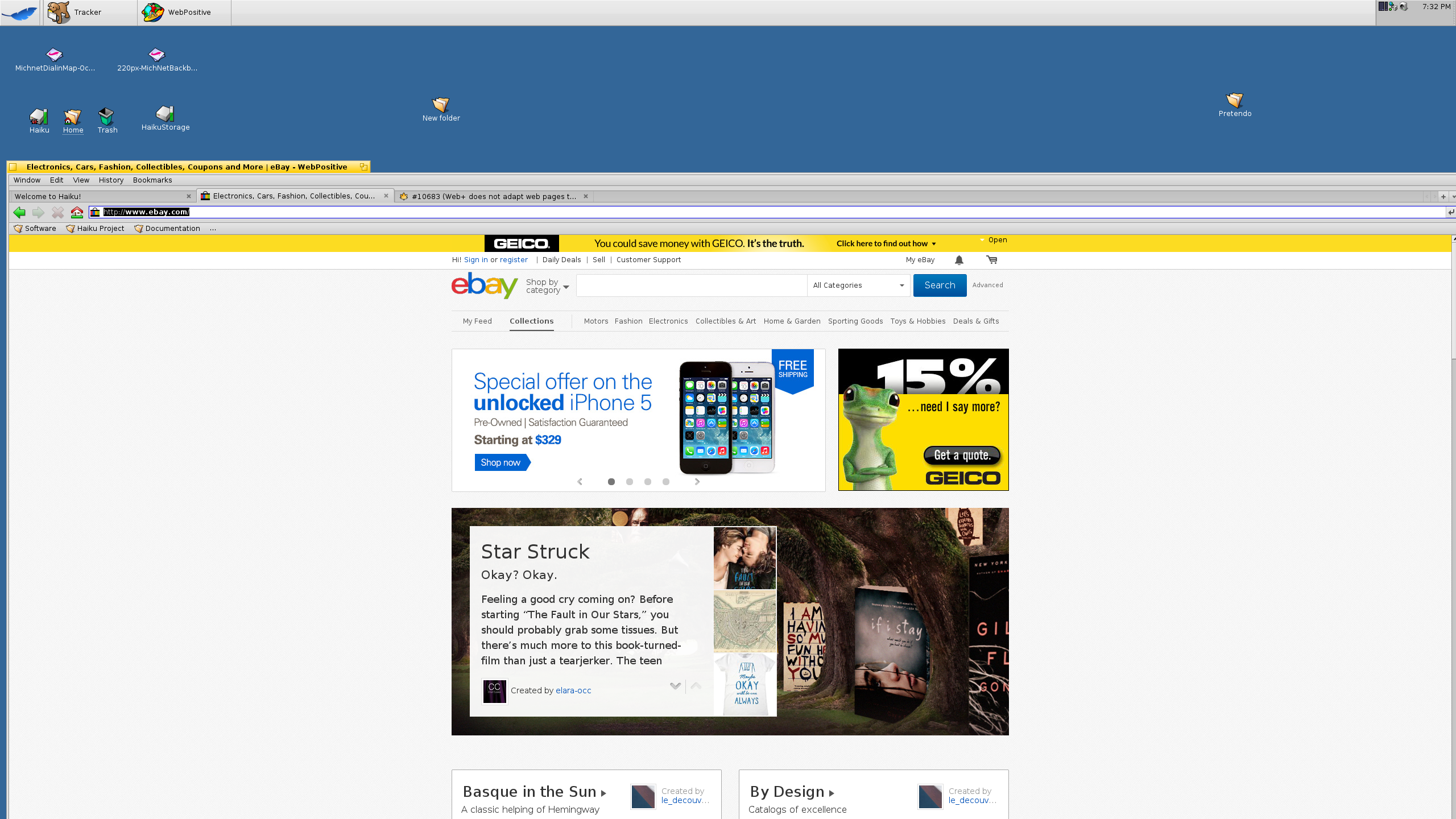
I tried this page in chromium for linux and I get exactly the same rendering as in Web+. In current version we are identified as desktop Safari by all websites I tried, and I didn't see any mobile layout in a while. So, we are already almost lying about who we are (we still have "WebPositive" and "Haiku" in the user agent). Same for ebay: the page has a fixed width layout and won't be larger than this.
Is your problem that we don't have retina display support and maybe some browsers on other systems are zooming everything x2 on such high resolution displays?
width issue and layout problems