Opened 8 years ago
Last modified 7 years ago
#13378 assigned enhancement
Checkmark label alignment too low
| Reported by: | humdinger | Owned by: | nobody |
|---|---|---|---|
| Priority: | normal | Milestone: | Unscheduled |
| Component: | Kits/Interface Kit | Version: | R1/Development |
| Keywords: | Cc: | ||
| Blocked By: | Blocking: | ||
| Platform: | All |
Description
This is hrev51022.
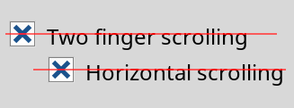
The label of checkmarks is a bit too low in relation of the checkbox. Here's a screenshot of the TouchPad prefs with a 24 font size to make it more obvious. I added the red line that goes dead center through the checkmark:
Attachments (5)
Change History (27)
by , 8 years ago
| Attachment: | Checkbox_Layout.png added |
|---|
comment:1 by , 8 years ago
| patch: | 0 → 1 |
|---|
comment:2 by , 8 years ago
| patch: | 1 → 0 |
|---|
by , 8 years ago
| Attachment: | Checkbox_label.png added |
|---|
comment:3 by , 8 years ago
| patch: | 0 → 1 |
|---|
comment:4 by , 8 years ago
| patch: | 1 → 0 |
|---|
comment:5 by , 8 years ago
I added the following piece of code to CheckBox.cpp under its Draw function.
labelRect.bottom = (float)(0.2f + be_control_look->DefaultLabelSpacing());
labelRect.top = (float)(0.2f + be_control_look->DefaultLabelSpacing());
The label is now moved few pixels up than the correct position (see attachment). I tried modifying the values, but still results the same. What maybe the problem here?
comment:6 by , 8 years ago
I wonder how we can compute something that works for all fonts and font sizes. For a font, we know the "baseline", which is usually just below the characters, and we know "ascents" and "descents" height (that is, the size of things that can go above or below the baseline). But, this does not give us a way to find the vertical "center" of the font. What should it be aligned with anyway? Center bar of H? Middle of o or central bar of e? In the middle between baseline and ascents?
comment:7 by , 8 years ago
I guess one has to try different formulas and judge what looks best. I would've assumed (ascend + descent) / 2 is the middle, which should be aligned to the height / 2 of the checkbox/popup/textcontrol.
follow-up: 10 comment:8 by , 8 years ago
| patch: | 0 → 1 |
|---|
follow-up: 12 comment:9 by , 8 years ago
How is the center of a 0..1 interval at 0.25?
Also, are you sure that this does not change things elsewhere? (BAlignment can be used in many places, not just checkboxes).
Does the label of checkboxes still align properly with the text and labels in other widgets? for example if you put a checkbox and a BStringItem next to each other?
comment:10 by , 8 years ago
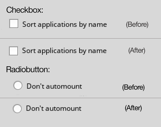
Instead of modifying the specific alignment for Checkbox, Radiobutton. I managed to change the Vertical Align value of the label across other panels. Here's the preview after the change.
Do let me know if there has to be any changes, I reviewed almost all panels, it does not seem to affect any other view. Let me know. Thanks.
comment:11 by , 8 years ago
Changing BAlignment is not acceptable, and certainly not the solution to the problem.
comment:12 by , 8 years ago
Those were my thoughts too, that was why I did ticket:13378#comment:5, but that doesn't seem to solve the problem either.
Replying to pulkomandy:
How is the center of a 0..1 interval at 0.25?
Also, are you sure that this does not change things elsewhere? (BAlignment can be used in many places, not just checkboxes).
Does the label of checkboxes still align properly with the text and labels in other widgets? for example if you put a checkbox and a BStringItem next to each other?
comment:13 by , 8 years ago
| Owner: | changed from to |
|---|---|
| Status: | new → assigned |
comment:15 by , 8 years ago
follow-up: 17 comment:16 by , 8 years ago
The patch doesn't make any sense to me. Why bottom + 1 - default label space? This incorrectly enlarges the label area outside of the view's bounds, and only creates a somewhat fitting (it's too high IMO) offset.
The code in BControlLook::DrawLabel() (lines 2071ff) is responsible for computing the label location, and it should be investigated why it doesn't work as expected here, and maybe if there is a case where it actually works as it should. This is a relatively new ticket -- maybe it's only broken with the new Robo fonts?
follow-up: 19 comment:17 by , 8 years ago
Replying to axeld:
This is a relatively new ticket -- maybe it's only broken with the new Robo fonts?
It's "Noto", Axel, "Noto". :) And it's not Noto, i.e. changing to the old DejaVu, or any other font for that matter, shows the same slight vertical misalignment.
comment:19 by , 8 years ago
Replying to axeld:
The code in
BControlLook::DrawLabel()(lines 2071ff) is responsible for computing the label location, and it should be investigated why it doesn't work as expected here, and maybe if there is a case where it actually works as it should. This is a relatively new ticket -- maybe it's only broken with the new Robo fonts?
I looked into that, DrawLabel() describes about the label's rectangle area, right? It draws the area where the label is supposed to be. lines 2071ff gets the font height, and draws the rectangle accordingly. These do not speak about the alignment of label within the rectangle. Do they?
Should I look into BLayoutUtils::AlignOnRect(), maybe that deals with the alignment of label inside the rectangle?
The patch doesn't make any sense to me. Why bottom + 1 - default label space? This incorrectly enlarges the label area outside of the view's bounds, and only creates a somewhat fitting (it's too high IMO) offset.
What I presumed was, since the DrawLabel() draws the rectangle, creating a padding for the label's bottom will push it to the center.
Replying to humdinger:
changing to the old DejaVu, or any other font for that matter, shows the same slight vertical misalignment.
Did my patch fix it for the other fonts, or it fixes only for Noto?
comment:20 by , 8 years ago
While your change might have fixed the symptoms in the default configuration, it surely doesn't get to the bottom of the problem, and thus, doesn't fix the actual issue. To fix a problem for real, one has to fully understand it first.
The code in BControlLook::DrawLabel() does look correct to me, as does how it's being called from BCheckBox, and BRadioButton. However, there must be a problem, or else it wouldn't show on screen, wouldn't it?
comment:21 by , 7 years ago
| patch: | 1 → 0 |
|---|
comment:22 by , 7 years ago
Marked patches as obsolete as they don't handle the problem the right way.


Checkmark label alignment