

Opened 7 years ago
Last modified 3 years ago
#14052 new enhancement
A few GUI enhancement suggestions
| Reported by: | konrad | Owned by: | stippi |
|---|---|---|---|
| Priority: | normal | Milestone: | Unscheduled |
| Component: | User Interface | Version: | R1/Development |
| Keywords: | Tracker | Cc: | |
| Blocked By: | Blocking: | ||
| Platform: | All |
Description
- First image is the selection. There is no padding on the left and right side, but there is padding on top and bottom.
- BBox titles are not vertical aligned. They look a few pixels off.
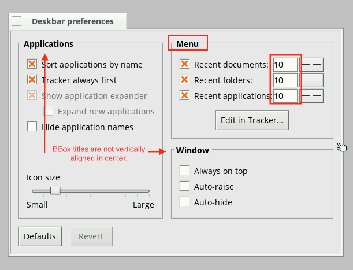
- Deskbar preferences (Recent Folders, Recent Documents and Recent applications input fields are missing left padding)
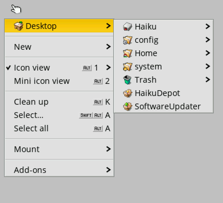
- BMenu (right click on desktop) Shouldnt fist and lat item has the same padding so the text is vertically aligned in center?
Attachments (3)
Change History (9)
by , 7 years ago
| Attachment: | padding_missing_textfield.png added |
|---|
by , 7 years ago
| Attachment: | selection_not_centered.png added |
|---|
Selection with tracker is missing padding for selected element
by , 7 years ago
| Attachment: | BMenu_odd_sizes.png added |
|---|
First and last item is missing top/bottom padding which makes it look odd
follow-up: 2 comment:1 by , 7 years ago
- BMenu. First item ("Desktop") and Last item ("Add-ons") are missing padding. They are smaller than the others. IMO they should have the same padding as "New" item has.
comment:2 by , 7 years ago
Replying to Mikael Konradsson:
- BMenu. First item ("Desktop") and Last item ("Add-ons") are missing padding. They are smaller than the others. IMO they should have the same padding as "New" item has.
It seems a menu separator item has a top/bottom padding for itself, which would explain the behavior.
follow-up: 4 comment:3 by , 7 years ago
For "selection_not_centered.png" there is already a bug report about it (a very old one).
In general it is simpler to track each problem in a separate ticket, so it is clear what is solved and what isn't. Otherwise it takes a lot of time to review the ticket and make sure everything was fixed (especially if you add extra things in comments afterwards).
comment:4 by , 7 years ago
Replying to PulkoMandy:
For "selection_not_centered.png" there is already a bug report about it (a very old one).
Did you mean #1319?
comment:6 by , 3 years ago
| Component: | - General → User Interface |
|---|---|
| Owner: | changed from to |
BBox title, and missing padding in Deskbar Preferences