

Opened 6 years ago
Last modified 3 years ago
#14898 new bug
Slider color use inconsistencies (DataTranslations, VirtualMemory)
| Reported by: | -Meanwhile- | Owned by: | stippi |
|---|---|---|---|
| Priority: | normal | Milestone: | Unscheduled |
| Component: | User Interface | Version: | R1/Development |
| Keywords: | QA | Cc: | |
| Blocked By: | Blocking: | ||
| Platform: | All |
Description
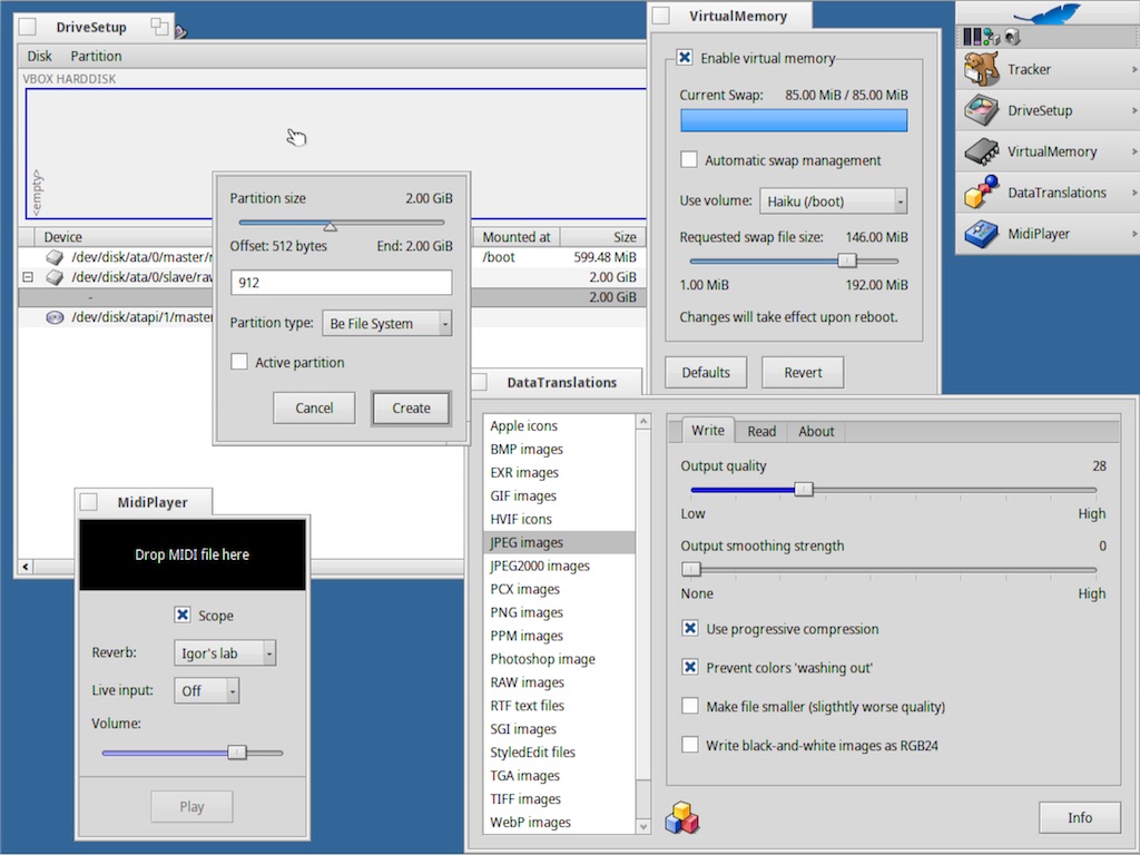
Preferences/DataTranslations has several items that show sliders. Problem is that some sliders show color (dark blue, to the left of the slider) and others in DataTranslations don't.
Color is only used in the menu items 'JPEG images' and 'JPEG2000 images'.
Then there's also VirtualMemory which also uses color to the left of the slider, but this time in another kind of blue.
In the rest of Haiku color in sliders appears only in Deskbar's Volume and in MediaPlayer (both have the same nice green left of the slider).
I think color suits the character of audio volume sliders well, but not so the other situations (where they'd best be scrapped, IMHO).
Attachments (1)
Change History (7)
comment:1 by , 6 years ago
comment:2 by , 6 years ago
I think there's no need to regulate when a developer should and should not use a fill color on a slider in their app, and in my round of QA I'm limiting myself to Haiku's base system and all that's included in it, because that's the starting point for each user and also the thing we can control.
The user will understand the difference between the OS and how it presents itself and the (possibly negative) effects 3rd party applications may have on it after installation.
This also means we can control the impression that DataTranslations makes on the user, as it's part of the base system.
You can adapt those jpeg sliders and the virtual memory one to the same blue, which is a step forward but you're then still left with a DataTranslations app that shows some sliders with color, and some without color. So that's then the remaining inconsistency.
That's why I suggested to get rid of that inconsistency by using no colors for sliders in the base system unless they are audio volume sliders. So you get a nice clean and consistent situation.
by , 6 years ago
| Attachment: | Haiku Filled Sliders.jpg added |
|---|
Haiku Apps using Sliders with Fill Color
comment:3 by , 6 years ago
Fully agreed, the Haiku apps and prefs should come with consistent widgets.
IMO, the B_CONTROL_HIGHLIGHT_COLOR of the VM prefs and DriveSetup look better that the stark blue used in the JPEG translators. In fact, I think we should default all BSliders to use it as fill colour.
follow-up: 5 comment:4 by , 6 years ago
+1 to B_CONTROL_HIGHLIGHT_COLOR
I'm not sure about setting a fill color by default however, I think it depends on the meaning of the slider. It makes sense when setting a partition size or a sound volume, because there is a notion of full vs empty, used vs unused, etc. part of the slider.
But I'd say there are cases where a slider is used as a way to compromise between two extremes, where none of them is full or empty. For example, the compression setting in JPEG is a compromise between "small size" and "better quality". None of the setting is "full" or "empty", they are just different choices. In that case, I see no justification for a filling color.
I would even say that in this case, we should use the triangle marker, rather than the rectangle block.
comment:5 by , 6 years ago
Replying to pulkomandy:
I'm not sure about setting a fill color by default however, I think it depends on the meaning of the slider. It makes sense when setting a partition size or a sound volume, because there is a notion of full vs empty, used vs unused, etc. part of the slider. [...] I would even say that in this case, we should use the triangle marker, rather than the rectangle block.
While I can see that one might be able to distinguish various uses of sliders, I think the differences are too subtle as to deserve a visual distinction. I expect most users would rather wonder why one looks slightly different than the next. Most devs wouldn't know when to use what either, I suppose...
IMO, having a consistent look - imagine some settings window with several different sliders, some blue, some with tri-knobs - is preferable.
comment:6 by , 3 years ago
| Component: | - General → User Interface |
|---|---|
| Owner: | changed from to |
Fill Color is a feature of BeOS Sliders https://www.haiku-os.org/legacy-docs/bebook/BSlider.html See BSlider::UseFillColor(). We do not currently regulate when a developer should and should not use a fill color on a slider in their app. The jpeg and jpeg2000 sliders have a fill color of 0, 0, 229 which is the default value for B_KEYBOARD_NAVIGATION_COLOR, while the Virtual Memory size slider uses B_CONTROL_HIGHLIGHT_COLOR. The jpeg and jpeg2000 translators should probably be updated to use a color constant instead of hardcoding color value. The use of 0, 0, 229 probably originates from BeOS which had limited color choices, earlier versions did not include the color constants in a InterfaceDefs.h and you had to pick something that could be displayed in 256 colors.