Opened 14 years ago
Closed 5 years ago
#6987 closed bug (fixed)
InfoWindow Owner clipped in layout
| Reported by: | Karvjorm | Owned by: | aldeck |
|---|---|---|---|
| Priority: | normal | Milestone: | R1/beta2 |
| Component: | Applications/Tracker | Version: | R1/Development |
| Keywords: | Owner layout | Cc: | Karvjorm |
| Blocked By: | Blocking: | #14870 | |
| Platform: | All |
Description
As shown in the enclosed picture, "Owner" is clipped when it is shown with a localized text that is a bit longer than orginal in InfoWindow.
I tried to write a patch to resolve this problem, but because my development environment is broken (can't svn update the whole svn tree [due to a VMware virtual machine environment and a USB stick disk for it, I suppose]), I was not able to test it.
I enclosing here also a typo patch and another missing localization patch.
Attachments (6)
Change History (31)
by , 14 years ago
by , 14 years ago
| Attachment: | InfoWindow.patch added |
|---|
Trying to solve a text clipping problem in a localized text.
comment:2 by , 14 years ago
| Owner: | changed from to |
|---|---|
| Status: | new → assigned |
comment:3 by , 14 years ago
| Blocking: | 7295 removed |
|---|
The localization in InfoWindow.patch includes spaces, which can trip up translations at HTA.
FilePermissionView.patch doesn't solve the issue. I applied it locally, but the labels are still truncated, the column labels are now just as wide as a checkbox. This is hrev40612.
comment:4 by , 13 years ago
| Component: | Kits/libtracker.so → Applications/Tracker |
|---|---|
| Version: | R1/alpha2 → R1/Development |
comment:5 by , 12 years ago
I think the best way would be the usage of the layout api, as was in the find window. And also the capacity string is looks like wrong. (Using 45710 nightly.)
comment:6 by , 9 years ago
Increasing the width of the columns will not look very nice for languages where the strings are quite long. I would suggest using 45° rotated text for the column headers instead?
comment:8 by , 8 years ago
| Resolution: | fixed |
|---|---|
| Status: | closed → reopened |
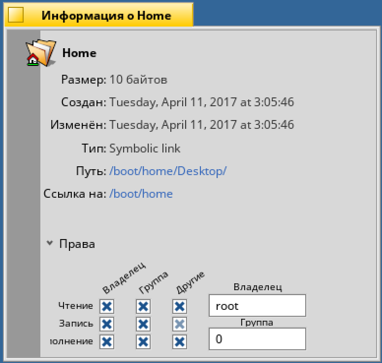
"Execution" is still cut off in Russian locale. As well as the first latter of rotated "Others" label.
by , 8 years ago
| Attachment: | infowindow.png added |
|---|
comment:9 by , 8 years ago
| patch: | 0 → 1 |
|---|
comment:11 by , 8 years ago
| patch: | 1 → 0 |
|---|
follow-ups: 14 15 comment:12 by , 8 years ago
I'm not too fond of the rotated text; I'd rather see wider columns.
Other options:
- U G O as headers, with a legend (user, group, others).
- 1. 2. 3. as headers, with a legend.
- icons as headers, with a legend.
- Put header in two rows (alternating).
follow-up: 16 comment:13 by , 8 years ago
BTW, Alt+p (to expand permission view) doesn't seem to work anymore.
comment:14 by , 8 years ago
Replying to axeld:
I'm not too fond of the rotated text; I'd rather see wider columns.
Other options:
- U G O as headers, with a legend (user, group, others).
- 1. 2. 3. as headers, with a legend.
- icons as headers, with a legend.
- Put header in two rows (alternating).
Hi
I "vote" for icons.
follow-up: 18 comment:15 by , 8 years ago
Replying to axeld:
- icons as headers, with a legend.
Like that idea best. Instead of a legend, how about tool tips for the icons?
I'd suggest the "x-person" filetype icon for "owner" and the "People" icon for "group". What to use for the "other" though?
follow-up: 17 comment:16 by , 8 years ago
comment:17 by , 8 years ago
comment:18 by , 8 years ago
Replying to humdinger:
I'd suggest the "x-person" filetype icon for "owner" and the "People" icon for "group". What to use for the "other" though?
Here's the above and a new ???-icon for the "other". These are 24px, don't look that nice in 16px...
comment:19 by , 8 years ago
| patch: | 0 → 1 |
|---|
comment:20 by , 8 years ago
| patch: | 1 → 0 |
|---|
comment:21 by , 6 years ago
| Blocking: | 14870 added |
|---|
comment:22 by , 6 years ago
Sorry for the duplicate 14870...
'Put header in two rows (alternating)' seems like the second best solution to me (after the rotated text).
comment:23 by , 5 years ago
Window has been rewritten to use layout kit. I think it solves this. Still using rotated text, however.
comment:24 by , 5 years ago
| Milestone: | R1 → R1/beta2 |
|---|---|
| Resolution: | → fixed |
| Status: | reopened → closed |


A clipped and localized InfoWindow "Owner" text