Opened 14 years ago
Last modified 3 years ago
#7115 assigned enhancement
Mouse pointer indicating resize direction
| Reported by: | humdinger | Owned by: | nobody |
|---|---|---|---|
| Priority: | normal | Milestone: | Unscheduled |
| Component: | Servers/app_server | Version: | R1/Development |
| Keywords: | CTRL+ALT resizing | Cc: | |
| Blocked By: | Blocking: | ||
| Platform: | All |
Description
There has been some discussion how to indicate the resize direction of windows when holding CTRL+ALT (the resizing is done with the right mouse button), see this thread. At the moment, the respective window borders are highlighted.
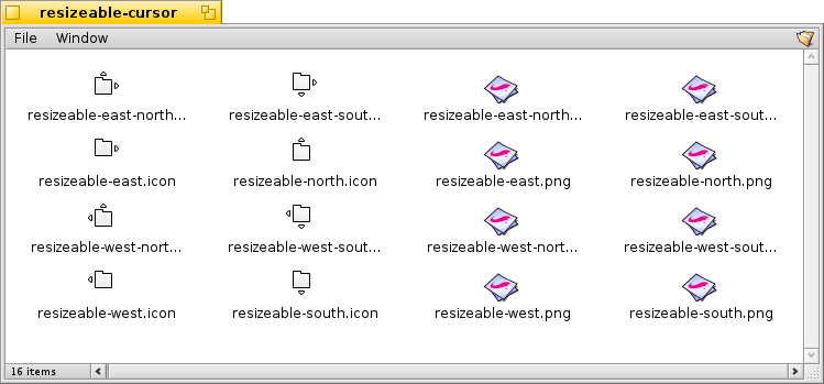
Instead of border-highlighting, one idea is to change the cursor and have it indicate the current resize direction. I have created the necessary pointers in Icon-O-Matic. Following Stippis advice, I imported them into WonderBrush, added a little drop shadow and saved the cropped images as PNG. It's all attached.
These are the pointers (I-O-M files without the drop shadow, PNGs don't get a thumbnail...):
The hotspot should be on the upper left corner of the little window. That way the little window should be steady while the arrows dis/appear when moving the mouse, indicating the current resize direction.
Once the right mouse button gets pressed, the pointer changes to the actual resize-cursor, which are already implemented. Likewise, left-clicking will change into move-mode.
Attachments (7)
Change History (21)
by , 14 years ago
| Attachment: | resizable-cursor.png added |
|---|
by , 14 years ago
| Attachment: | resizeable-cursor.zip added |
|---|
The mouse pointers as I-O-M files and PNGs
comment:1 by , 14 years ago
I know you said in the mailing list thread that having all 4 arrows drawn to show "move" with the resize ones differently coloured was too confusing. However I'm still uncomfortable having the cursor reflect right-click behaviour, that seems unexpected to me.
Perhaps other ways of showing the active resize border could be explored - highlighting within the "little window", a small dot in the "little window" in the right corner or something?
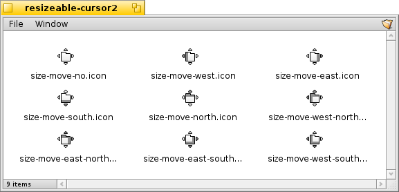
comment:3 by , 14 years ago
Added I-O-M files for the second version of the cursors, before I accidentally delete them locally... :)
I can convert them to PNG with drop shadow when needed.
comment:4 by , 14 years ago
Ingo expressed a preference on the ML for the second set. I prefer them too.
I wonder how it would look if only the window shading was used to express resize border, and the arrows were all white for all of them, which might imply move (the primary mouse button action) a little more strongly.
comment:5 by , 14 years ago
Sorry for the useless attachment; the file browse button really doesn't work well in Firefox+Ubuntu (and ends up actually choosing the path of the file above the one clicked...grr).
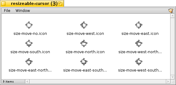
Anyhow, here's how the cursors would look if they all had all the arrows white (mocked up in GIMP so I can't provide the IOM files I'm afraid).
comment:6 by , 14 years ago
No idea if tangobravo's all-white arrows are better or not. I guess it's a matter of changing a resource file once the mouse pointer feature itself is implemented.
comment:7 by , 10 years ago
| Milestone: | R1 → Unscheduled |
|---|
Moving out of R1 (sorry, but I'm trying to get a better picture of how far R1 is).
comment:8 by , 8 years ago
| Owner: | changed from to |
|---|---|
| Status: | new → assigned |
comment:9 by , 3 years ago
This ticket is a bit older, so i'm not sure what the state was then.
These cursors look good to me, but they clash a bit with the "currently resizing" cursors, are they intended only as control hints for which resizing mode will be picked when starting now? Perhaps they should then be added and the resizing cursors changed somewhat, or these cursors made to look more like the resizing cursors (but in a way that clearly destinquishes the "am resizing" and "could resize" states, while making the direction clear)
comment:10 by , 3 years ago
Over the past decade since I filed that ticket, I got so used to the blue window borders indicating the possible resizing direction, that I'm not sure a changed mouse pointer is even necessary... I definitely don't want a changing mouse pointer instead of the coloured window borders.
If needed, maybe we can use the same arrow pointer we no now have when actually resizing, just in the same blue as the window border indicator.
comment:11 by , 3 years ago
I agree, the blue borders are a nice indication. If anything the mouse cursor could be changed in addition to it, to make it a bit more clear what the blue border means and what is about to happen, for discoverability. (A different older ticket for app_server mentions that TeamMonitors shortcut might show these borders for a bit too, personally I think this is good in that it aids discovery of the feature aswell)
comment:12 by , 3 years ago
The initial idea of using cursor was nice, but the second attempt (with both resize and move) attempts to pack so much information into the cursor that I think it ends up being quite undecipherable.
I think the blue borders make a much better job of showing how the window will be moved/resized?
In that case, just one cursor indicating "resize/move" mode, in combination with the highlighted border, would probably work just as well. And it's probably a bit simpler to implement.
comment:13 by , 3 years ago
comment:14 by , 3 years ago
Yes, I think this one is a good hint about what will happen and supplements the border highlight very well.


Mouse pointers