

Opened 13 years ago
Closed 5 years ago
#8900 closed enhancement (fixed)
Design of Contextmenu
| Reported by: | Morbid | Owned by: | leavengood |
|---|---|---|---|
| Priority: | normal | Milestone: | R1/beta2 |
| Component: | User Interface | Version: | R1/Development |
| Keywords: | Cc: | ||
| Blocked By: | Blocking: | ||
| Platform: | x86 |
Description
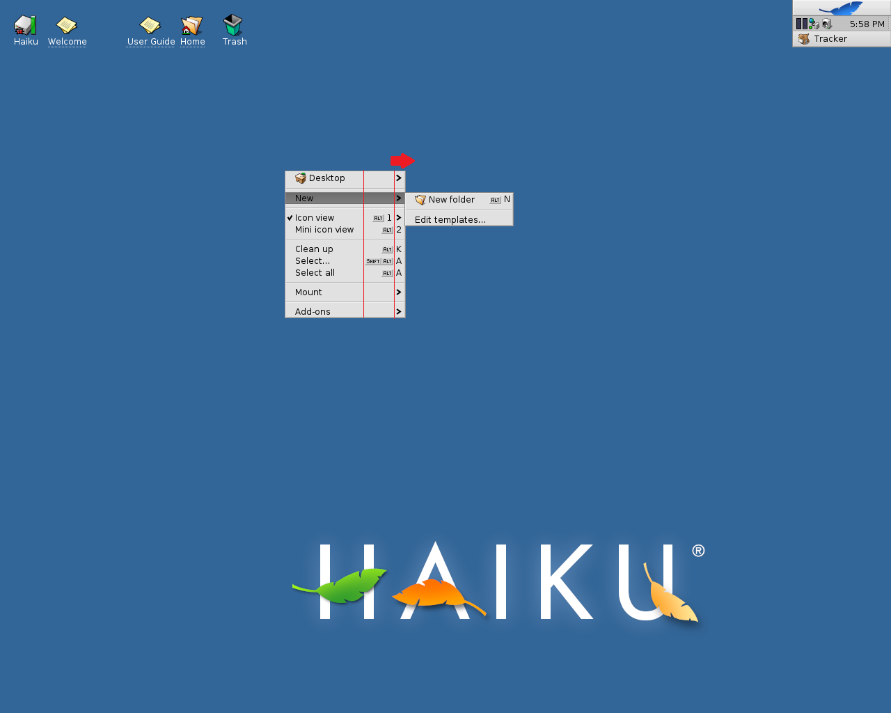
Contextmenu on Desktop should be streched a little to the right and Shortcuts placed in one column behind the arrows. What do you think?
Attachments (6)
Change History (33)
by , 13 years ago
| Attachment: | screenshot2.png added |
|---|
comment:1 by , 13 years ago
| Type: | bug → enhancement |
|---|
comment:2 by , 13 years ago
| Owner: | changed from to |
|---|---|
| Status: | new → assigned |
comment:4 by , 13 years ago
But I'm not sure how much I like it. Other platforms that I've just looked at (Ubuntu and OS X) don't seem to leave this space.
comment:5 by , 13 years ago
For me it looks a little more professional! Did'nt try Ubuntu and OS X! Maybe we have to ask other guys about it. But i don't want to make an elephant out of a fly. LOL "professional" was the wrong word, sorry for that. "Elegant" is the right word.
comment:6 by , 13 years ago
I can't speak for all Haiku developers, but for me the small things matter so I'm fine with these sort of suggestions.
What is unique to Haiku compared to those other systems is menu items which have both a shortcut and a submenu, and I think this change makes sense when you consider that. In fact that is why that menu might look a bit strange normally.
But looking around the system with this change I see a few issues (menu items which don't look as good) so I'll hold off for now until after the release.
comment:7 by , 13 years ago
So I don't lose it, here is the patch which fixes this, including fixing the alignment issues I mentioned in my last comment.
by , 13 years ago
| Attachment: | align_shortcuts_ticket_8900.patch added |
|---|
comment:8 by , 13 years ago
| patch: | 0 → 1 |
|---|
comment:10 by , 13 years ago
I would say the spacing should only appear if there is any sub menu, otherwise, I could imagine this won't look as good. I like the changed alignment better in any case, though.
comment:11 by , 13 years ago
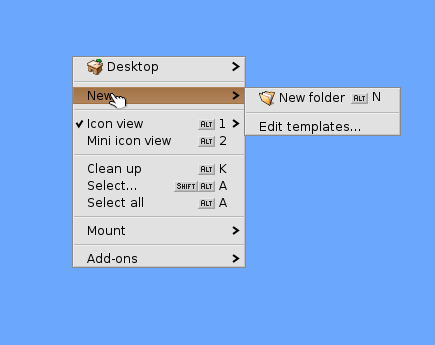
Ok! And what do you think about the Arrows! I like the Arrows in Tracker-Menu! See Screenschot!
by , 13 years ago
| Attachment: | screenshot3.png added |
|---|
comment:12 by , 13 years ago
What are you talking about? The arrows didn't change or did I miss something.
by , 12 years ago
| Attachment: | Just_like_this_Demo_Arrows.png added |
|---|
comment:14 by , 12 years ago
| patch: | 1 → 0 |
|---|
My two cents:
- I find the proposed alignment looks more tidy and improves readability (much like with good codestyle).
- As axeld said, the spacing should appear in case there are submenus only.
- The arrows from the demo pic are less intrusive and steal less attention, which I find better too, as the menu item text deserves the primary focus.
comment:15 by , 12 years ago
Thanks for commenting and to engage with my "cry's"! I know there are other Problems witch are more important to solve. If i may say this here: Great OS and big THANKS for HAIKU.
comment:18 by , 12 years ago
I just didn't keep up with Haiku development for a while.
As seen from the patch the basic implementation is pretty simple. It would be a bit more complicated to only do the padding if there are submenus anywhere on the given menu, but I can probably get it to work.
comment:20 by , 7 years ago
| patch: | 1 → 0 |
|---|
comment:21 by , 6 years ago
The patch is 404 on Gerrit now. No big deal, the menu code has changed quite a bit since the patch. I see the places that need to change to reproduce it.
Doing what Axel suggested (only shift things over if there are submenus) is kind of a pain because menu items would need to know if any other menu items have a submenu to adjust where they render their shortcut symbol. So as far as I know they would have to query up to their parent to ask and the parent might want to cache that knowledge. But we are sort of running out of room in BMenu, though it is full of crufty booleans that I don't think we need anymore, so I could maybe repurpose one.
I personally would not mind just always moving things over so menus are always consistent, which is basically what the simple version of this change does.
comment:22 by , 6 years ago
The patch is still there (of course), it just seems that I failed copying the URL here.
comment:23 by , 6 years ago
As mentionned there, adding the space for the shortcut arrow is fine now (as another patch since then made that arow smaller and similar in size to the checkmark on the other side, which always has reserved space as well). We just need to make sure it looks fine when there are no shortcuts in a menu.
comment:24 by , 6 years ago
OK, thanks, and I see you updated the patch for the current code. I'll download that change from Gerrit and give it a try with various menus to make sure it doesn't cause issues. Then hopefully we can get it merged.
by , 6 years ago
| Attachment: | context-menu-alignment.png added |
|---|
comment:25 by , 6 years ago
So I cherry-picked the latest patch and applied it. My first reaction was that I do not like it. But now I am not sure. Attached is a comparison between the normal on the left and the patch on the right. I would include the screenshot in this comment but it is a bit too big.
I don't think it is worth it to try to dynamically add the space only when there are submenus in the menu being drawn. Either we add the space or we don't.
FWIW I noticed Windows (8 at least) does this with the left side where there can be icons, like here:
https://www.online-tech-tips.com/wp-content/uploads/2014/02/context-menu-windows-8.jpg.optimal.jpg
I think Windows 10 does too.
So we would not be totally out on our own here to line things up.
comment:26 by , 6 years ago
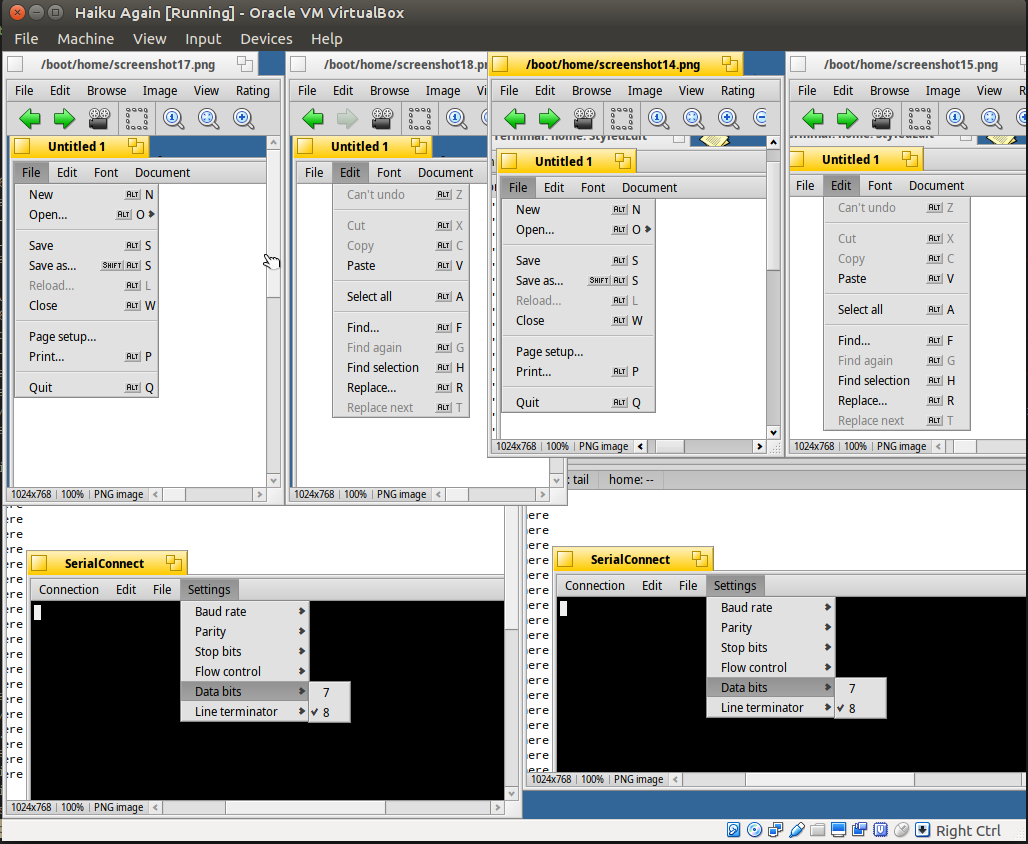
The new layout looks fine to me except for the "data bits" submenu which is clearly unbalanced. I think the current layout is:
- checkmark
- label + margin
- shortcut (if used)
- arrow
And we could switch to:
- checkmark
- label
- margin + shortcut (if used)
- arrow
However that's a minor thing, if it's too complex to achieve I would just merge the change as is
comment:27 by , 5 years ago
| Milestone: | R1 → R1/beta2 |
|---|---|
| Resolution: | → fixed |
| Status: | assigned → closed |
That remaining issue has been fixed and the patch is merged.
You are just suggesting leaving the space for the submenu arrow when there is no submenu so that all the shortcuts are in the same column? That seems reasonable and should be easy enough. I'll take a look at this after our alpha4 release is done.